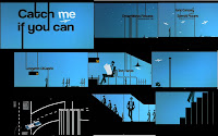
The title of the film is in a bold black font that is contrasting on a light blue background, which works to good effect as it stands out on the screen. We do not get revealed to the setting/location because the title sequence has been edited so much that it is just animation, but we instantly catch onto the storyline that it is a chase sequence as it shows one person clearly running from another. There are no costumes or props used in this opening sequence as it is amination and there are no people, but we can see objects being used by the animated objects, such as a newspaper, which is just as effective as it would have been if we saw it normally because it is clear to an audience what it is and it shows who has the power in the scene. I think that throughout it has very good and interesting editing because you never often see an opening sequence that is completely animated, which is good because it is unique but also very effective. The font style is always quite big and bold on screen, but it is constantly changing colour depending on the background of the shot so that is contrasts and stands out. All we learn about the story from the opening sequence is that is a chase sequence because it is clear someone is being chased, but it is not clear why, so the audience is interested in what is hapening and why from the very start. The opening suggests it is a thriller because although it uses bright colours unlike a typical thriller, we see that there is someone running from someone else, but it is not revealed to us why. The characters are not introduced to us but we get a rough idea who the main two character are because there is the focus on just two characters throughout this opening sequence, of them just running.
No comments:
Post a Comment