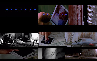
 It is quite clear that Memento is a thriller, even from the title's at the beginning. The title's give the impression that it is a thriller because they are being presented on a black background in a blue font on the centre of the page. This gives the impression that it is a thriller because of the use of contrasting colours to the black background which could indicate danger. Memento has a different start to many pther thrillers and begins by showing the end of the film and then it worked backwards showing the build up to the ending. This works well because the audience are kept constantly on the edge of their seat and want to see why what happened at the beginning did and what caused this to happen. This is very successful in the film because the the story of what happened is slowly revealed always keeping the audience interested and entertained by the film. Another good thing about Memento that makes it clear that it is a thriller is the music in the background; this is because the music sounds very dark and mysterious which adds tension throughout the film, which is very effective and gives the impression that soomething bad is going to happen, because it helps to make the mood seem very tense. The fact that we do not know much about all of the characters is also very effective, all we get to know is what is wrote on the photo about them. This also works well because although we know what we have been shown on the photo, we also build our own impression of characters as an audience so we sometimes felt that you were being lied to about what is on the card and what is actually presented to us from all of the characters. All of the tatoos the main character has over his body also help to add to the tension because we do not understand what most of them may mean so when we see them we want to try to work out what they mean and why he has got them. In my opinion i think that Memento is a successful thriller because, like most thrillers do, it always keeps the audience in the dark as much as possible but still gives away some of the story, keeping the audience constantly interested. It also sets the mood of the film with the eerie music and dark colours which reveals to the audience what sort of film it is. The fact that is reveals the story so slow is very effective and important because it keeps the audience constantly interested in the film.
Thursday, 10 February 2011
Memento
 It is quite clear that Memento is a thriller, even from the title's at the beginning. The title's give the impression that it is a thriller because they are being presented on a black background in a blue font on the centre of the page. This gives the impression that it is a thriller because of the use of contrasting colours to the black background which could indicate danger. Memento has a different start to many pther thrillers and begins by showing the end of the film and then it worked backwards showing the build up to the ending. This works well because the audience are kept constantly on the edge of their seat and want to see why what happened at the beginning did and what caused this to happen. This is very successful in the film because the the story of what happened is slowly revealed always keeping the audience interested and entertained by the film. Another good thing about Memento that makes it clear that it is a thriller is the music in the background; this is because the music sounds very dark and mysterious which adds tension throughout the film, which is very effective and gives the impression that soomething bad is going to happen, because it helps to make the mood seem very tense. The fact that we do not know much about all of the characters is also very effective, all we get to know is what is wrote on the photo about them. This also works well because although we know what we have been shown on the photo, we also build our own impression of characters as an audience so we sometimes felt that you were being lied to about what is on the card and what is actually presented to us from all of the characters. All of the tatoos the main character has over his body also help to add to the tension because we do not understand what most of them may mean so when we see them we want to try to work out what they mean and why he has got them. In my opinion i think that Memento is a successful thriller because, like most thrillers do, it always keeps the audience in the dark as much as possible but still gives away some of the story, keeping the audience constantly interested. It also sets the mood of the film with the eerie music and dark colours which reveals to the audience what sort of film it is. The fact that is reveals the story so slow is very effective and important because it keeps the audience constantly interested in the film.
Thursday, 20 January 2011
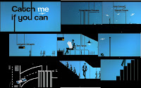
Catch me if you can title sequence
Tuesday, 18 January 2011
Monday, 10 January 2011
Conventions of an opening sequence
Conventions of a thriller
Thursday, 6 January 2011
Casino royale opening

Friday, 17 December 2010
Conventions of a title sequence
Monday, 13 December 2010
Brick opening

The title is in a big, bold, white font in the centre of the screen, so it is the audiences main point of focus and it stands out compared to everything else on the page.
Setting/location:
From what we see in the opening sequence the film is set in an urban environment. We see this first through a long/estbablishing shot of our main character standing over the dead body of a girl who we gain an understanding that he was very close to her.
Costumes and props:
All of the characters that we see are all dressed reasonably casually to represent that they live in a suburban area, but this also represents the age of the characters, that they are all quite young. There is a brace;et on the girls arm which we see an extreme close up of when she is dead, but then it cuts to another shot of the bracelets on the girls arm putting a note in someone's locker to help show that it is the same girl.
Interesting camerawork/editing:
I think the close ups of the dead girls different body parts when she is dead, such as, the bracelet on her arm, her hair covering her face and legs was very effective because we gain the understanding straight away that she is dead, but we do not know why or how this has happened.
Title and font style:
The font is in a big, white font contrasting on a black background, like most other thrillers, and is in the centre of the screen so it's the main focus of the audience.
Story:
We see a guy, the main character, staring at the body of a dead girl. We undnerstand that these two used to have something between them as the boy looks really upset looking at her dead body. The viewer wants to find out what has happened to the girl, which means many questions are being asked so it will have intrigued a viewer so they watch the rest of the film to find out what has happened.
Genre:
The genre of the film is clearly thriller because from the very first three shots you see that somebody has been killed but we do not know how of who by, which creates a sense of tension. This works because the audience do not know what has happened so there is also a sense of mystery which works well with the genre of thriller.
How characters are introduced:
The two main characters are first seen with the guy standing by the dead girl but they are introduced with name when they are speaking on the pay phone. This is important because it establishes to the audience who the main characters are and what role they have in this film.
Wallander opening

The title is in a very different format to most others because although the font is big and bold, it is black on a yellow background, unlike most others that have a bold white font contrasting on a black background. The colours of yellow and black could be used to represent the danger in the film.
Setting/location:
The setting/location is first seen through an establising shot, which is seen as a point of view of either a plane or helicopter. It begins by just showing the sea but then pans up to show the land ahead of the plane/helicopter. This is effective because you know they are right by the sea instanly, and you begin to ask questions asking whether the sea will play a later role in the film.
Costumes and props:
We only see costuming of the two girls as they walk away from the cab. One of them is dressed in a very gothic style, with a leather jacket, jeans, and we see is covered in blood holding a knife. The other is also fressed in balck but is just casual, with a jumper. This is effective because the colour black can help represent that the two characters are dark characters.
Interesting camera work/editing:
The piece of editing I thought was the best and most interesting was when we see the girl on the left drop the knife, and the title credits then come in. I thought this was effective because it all seems like one motion in which she drops the knife and the titles come in once she has dropped it. It is clear that the shapes in black on the yellow background is the outline of the knife as it enters from the top of the screen, with the point first, and falls in the shape of a triangle which is used to resemble the knife.
Title and font style:
The title and font style is very basic it is a black font that is reasonably bold, on a contrasting yellow background. This is done to make the font stand out on the page and be the only thing that the audience's attention is on.
Story:
The story is kept very secret to an audience member. All we understand from this opening sequence is that there is a cab driver who has been severely beaten by two girls, and later we see one of them drop a knife which then the viewer immediately understand that this driver has been stabbed during this assult. This does what any successful title sequence does, which is leave the audience asking questions, such as, why have they stabbed him?, what did he do to motivate this?, who are these two girls?, why did they do this?
Genre:
It is clear that it is a thriller because we are kept asking questions as to why this event has happened, but also we have seen that there has been a murder which is iften incorporated in most thrillers. It also leave's questions being asked and having a lot of tension which most thrillers do.
How characters are introduced:
The characters are introduced in a very negative way, the two girls instantly a shown as being very negative, bad characters as they have killed someone and are just walking away casually as if they have done nothing wrong. We are introduced to these characters in a very negative way so we do not really like them but also cannot understand why thye have done this.
Sunday, 12 December 2010
Double Indemnity opening

The title of the film appears in a big, bold, white font with a silhouette in the background. This is so that it stands out on the page and is the viewers main focus point.
Setting/location:
It begins with an establishing shot of a car speeding down a road, showing it is a big city that this film is being set in. To avoid any confusion as to where the film is set there is a film to the left of the picture that says: 'Los Angeles' on it.
Costumes and props:
The costunming that we see from the characters is quite smart. As we see the the main character step out of a car in a big coat, but underneath he is wearing a suit. This shows that he is part of an upper class society in the city, but that his job is very good and he earns a lot of money. We also see the man in the lift in a suit which indicates that the workplace is very big and successful, regarding the time that the film is set.
Interesting camerawork/editing:
The shot that i thought was very effective was where there was the silhouette on crutches coming towards us slowly, and when it eventually reached the front of the screen there was a blackout and the shot faded out into the opening shot. I thought this was effective because it flowed very well and seemed continuous which made it seem very good. I liked this because although it is a very simple transition it is very effective.
Title and font style:
The font in this opening sequence was the sane as the others, in just a large, bold font on a contrasting black background. This is effective because it is seen in every title sequence for a thriller, so an audience may now expect to see this, and it makes the font stand out on the page so it's the audience's main focus point.
Story:
The story is kept very well hidden which keeps the audience in suspense and make them want to keep on watching this film s othey find out what has happened. It basically shows a car speeding down a road which immediately asks questions from an audience perspective because they want to know what has happened and why this car is speeding down the road. We later find out the man in the car works for s big ensurance company and is obviously a big name there as he is recognised straight away. We see a gunshot sound in his shoulder and find out he has killed someone so again questions are raised as to why this has happened and what happened leading up to this.
Genre (thriller):
The film is clearly a thriller because from the beginning there is no explanation to what is heppening and why this is happening. We want to know why he is speeding in his car, why he has a gunshot wound in his shoulder and why he has comitted a murder. There are questions asked and there is a tense atmosphere as we want to know what has happened and why.
How character are introduced:
The main character that we see in the car we do not know anything about them until they step out into the office. We find his name out instantly, Mr. Neff, because he must be big and successful at his work to be known instantly on a namen basis. This created an image in out head that this character is up to something, or has done something, but no-one suspects it because of the image he has already built to other characters in the film.
Thursday, 9 December 2010
6th Sense opening

Kiss Me Deadly opening sequence

Special shots/effects:
Monday, 6 December 2010
Memento opening sequence

Monday, 29 November 2010
Example of the roles in an opening sequence
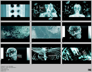
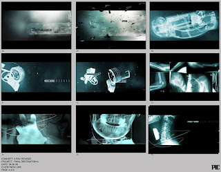
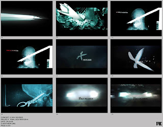

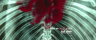
Roles different people have in creating films
Executive producer- Usually reserved for a producer with financial interest it the production.
Casting- The person who decides who they think would fit the role the best and most appropriate out of the auditionees or just well known actors they think would best fit the role.
Costume design- Person that selects what each character should wear corresponding to their personality in the scene and how to add more tension to it via characters clothing.
Music- Person who selects music to be played in scenes that help set the mood of it for an audience to relate to the scene more.
Editing- The person who decides whether or not to add transitions between shots, if there needs to be any special effects involved.
Production designer- Involved in designing how the set should look in the scene and what the lighting hould be like( high/low key).
Director of photograhy- Responsible for framing, camera angles and movement, lighting and the technical requirements to translate a script and storyboard into images on film.
Writer- Person who originally wrote the script or book before it wa put into film form.
Director- Responsible for turning the script into a sequence of shots and what tone the film should have and what an audience should gain from the cinematic experience.
Dexter opening sequence
This is a good opening sequence because it has a twist to it because in the clip it appears that he is is eating his breakfast; but at times it looks quite brutal as if he is killing someone, because on the program he works as a killer so it adds a twist to this opening sequence. However, the one thing that this opening sequence does that not many other do is it does not include any of the people who were involved in the making of the program, for example, the producer or director. This is a good opening sequence because although this seems to be quite a negative program because it has a lot of killings in it the opening sequence gives a diffeent impressionn because it seems quite playful and upbeat with the music in the background and the fact this opening sequence is based around him eating his breakfast.
Superbad opening sequence
I think that this is a good opening sequence because straight away it will catch an audiences attention to the film because it is different to many other opening sequences because they have a coloured silhouette, rather than a black one, which sets the tone that it will be a funny upbeat movie. Also the music used is quite a high tempo which shows at will be a funny movie. They manage to fit in all of the producers and characters names around the silhouette's of the characters dancing which is effective because the audiece will be able to see what is happening in the shot but also it gives the infirmation of who is in the film and what companies were involved in the making of it.
Friday, 26 November 2010
Understanding the purpose of an opening sequence
The purpose of an opening sequence is to let the audience know what is going on within the film and help to set the scene for where it will be set throughout. It also introduces all of the actors that are going to be included in the film throughout, which could be ne of the reasona that many peopole may have paid to go and see that film (because if there are big name actors that they will recognise in it). They also gradually interest the audience in the film because they often begn with something that would shock the audience, and from that point in keep them interested and want to find out what has happened. The choice of font used in a title sequence can help set the genre of the film because, for example, in se7en, in has quite rough words which appear to be handwritten, or look as if they have been, indicating that the film is going to be a thriller becuase the font chosen looks quite mysterious and a bit scary. Most successful opening sequencs give something away in the film that will keep an audinece member guessing throuhghout what has happened and make sure that they are keeping them interested in the film and want to know what has happened.


